A Taxonomy of Text-based User Interfaces
What do NetHack, git, the white pages, chatbots, and Visual Studio all have in common?
(Well, they can all be quite frustrating, but that’s part of my point. Read on.)
They’re all text-based user interfaces. In each case, text is the center of attention; the reason for the UI to exist. But each one has its own strengths, foibles, and suitable purposes. Today I’m going to explore the way these interfaces are the same, and the many ways they are different.
In my day job, I’m responsible for designing and testing text-based interfaces. I was also raised by an old-school Unix geek. So it’s a topic near and dear to my heart. First, an enumeration of a variety of TUIs; then, a brief taxonomy of the types of TUIs, and what makes them different.
An avalanche of examples
NetHack is a computer game whose interface is drawn only using text:

You, a humble @, and your trusty d (dog), explore and fight your way down to the depths of a vast dungeon, facing everything from irate shopkeepers to the fearsome Balrog. All interaction is via keyboard, with the familiar hjkl to move, (q) to quaff a potion, and so forth. (The crowning example of this, IMHO, is Dwarf Fortress, the maddeningly complicated descendent of the above.)

The white pages are almost extinct, but used to be a heavy object made out of flattened trees; on it, in alphabetical order, were the names of almost everyone in your neighborhood, followed by a dotted line, at the end of which was their phone number. Really important people were not in the phone book, which you could tell only by looking them up and not finding them.
You interacted with the white pages by opening to any page and trying futilely to find the right Smith, John in the Manhattan section.

There are a thousand chat-bot based interfaces nowadays, everything from your pharmacy-bot telling you to pick up a prescription to a travel-agent-bot which walks you through many choices and steps to buy airline tickets.
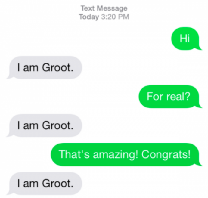
Some of these chatbots are more sophisticated than others. This one simulates a real Marvel superhero with 100% authenticity; it’s quite breathtaking.
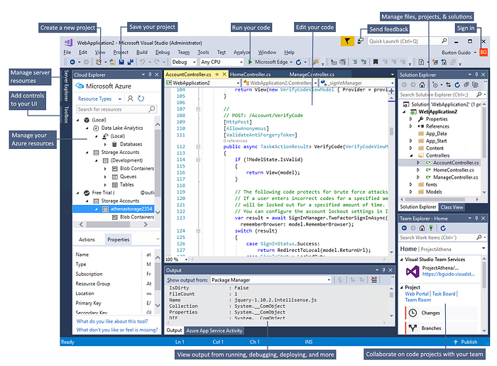
Visual Studio is Microsoft’s flagship product for programming, including a very smart text editor which is well-integrated with a number of auxiliary programming-focused tasks. This makes it an IDE, an Integrated Development Environment, of which there are many. You interact with VS via a mixed graphical/textual interface; primarily by entering code as text in an editor window, but also by clicking various buttons and peering at various displays that show debugging information, stack traces, dependency graphs, and so forth.

And git is a hazing ritual that programmers inflict on one another — err, rather, it’s a version control system which helps developers work in parallel and keep a record of their past work. You interact with git at a command line, typing commands like git add newfile.txt to add revisions, merge, and so forth; in response, the system gives status messages and changes files on disk.
Taxonomy Time
That’s quite a varied list, but all of them count as text-based interfaces.
Let me try to group these so we can talk about them collectively.
Group 1: Embedded Interfaces

bash. (Also via Wikipedia)Git, and a host of other commands like sed,sort,ls,grep, and so forth, are examples of the sort of self-contained, powerful utility that Unix is known for. But these programs aren’t anything on their own — they require that context around them to truly become useful. By itself, grep (which finds strings inside other things) doesn’t do anything; it’s only when you apply it to a file system that it springs to life, finding that file you were looking for. And it gets more powerful the more pieces you add. Something like grep -l -s 'deleteme' myfiles/* | xargs rm -f is a really powerful (and scary) way to delete a bunch of files with a particular string in them.
These embedded interfaces use text as the communication and coordination mechanism. They’re very similar to programming languages, but not quite the same; they exist in a persistent, stateful environment, and are bound by its rules. Unix commands can’t show
Group 2: Conversational Interfaces
Like the chatbot above, some interfaces are meant to simulate a human-language conversation. (All conversational interfaces are arguably embedded interfaces, too; but the intent is different.)
These have the strength of being at once more user friendly, and more user hostile. Almost everyone knows how to speak a natural language, and computers keep getting better and better at simulating it. The downside is that there still isn’t a human at the other end of things, leading to situations like this conversation I had with my iPhone:
“Siri, tell my wife I love her.”
“Here’s your message for Jennifer: ‘I love her.’ Would you like to send it?”
“No, no! Just tell her I love you.”
“Who would you like to tell I love you?”
So close, Siri, so close.
Group 3: Programming Languages
These are perhaps the most expansive and the most self-explanatory. Each language, including its ecosystem of libraries and common idioms, practices and policies, make up an interface.
These interfaces get refined over time; it was interesting to see language features appear in CoffeeScript to smooth over awkwardness in the interface of JavaScript, and then see those features (like arrow functions and comprehensions) find their way back into the core language or other commonly-used libraries.
I’ve written on what makes a good programming language previously, and encourage you to read the above article for more on the subject.
Group 4: Text As Graphics
NetHack is an example of a Text-as-graphics interface. These systems are an early form of GUIs. As such, they have many of the same pros and cons: it’s easy to understand the situation a glance, there are reusable controls that people can learn and apply in novel situations, and the user may have a lot of guidance about what they can do next.
They don’t always need to look like the above. Sometimes they look like a menuing system:

Menu systems like this ruled the world for two decades, at least, and still exist in some corners of the world. They’re easy to use, and easy to program.
The downside is complexity; there’s a lot going on at once, and users can easily get confused or lost. It’s also hard to multitask, and it’s generally quite challenging to try to move data from one place to another (the sort of thing cut-n-paste or drag-n-drop makes easy).
For developers, the interface complexity makes it hard to maintain larger systems; you end up with the same problems as GUIs, with lots of screens and lots of branching. One significant benefit is that you can use mature GUI prototyping tools like Axure or Adobe XD to manage that complexity; and you can run usability tests even if all you have is a text editor. (For more detail, check out the article below.)
Now what, wise guy?
One can’t simply propose a taxonomy with out doing something with it. But you’ll have to stay tuned for Part 2, wherein we discuss how to decide what you’re working on, and why it matters.
(If you’ve enjoyed this section, why not clap a bit for it? I’m required by law to say that. Also like, subscribe, tipyerwaiterandkeepyourstickonnaice…)
