Come for the features, stay for the experience
Someone recently quipped “Bad UX is almost never the cause of failure or explanation for success for a product.” It’s trolling, but it’s such a common refrain that it’s still worth taking a look at.
See…

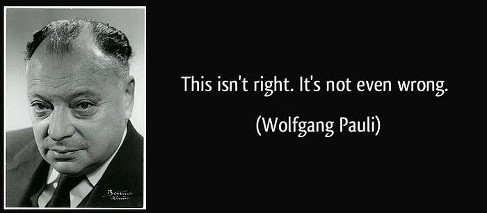
It’s…not even wrong. To understand it, we have to pull apart what it asserts.
“Sprinkle some UX dust on it!”
First, it poses UX as a separate thing: that UX is somehow layered on top of a product, a separate layer that can be flipped on and off.
This is a very common misunderstanding, enough so that Fabricio has recently written a fabulous breakdown of it:
The user experience is the net result of construction of your product and its placement within the world; it’s a result of what is created, plus the user’s context, plus the rest of the world.
Utility, Usability, Beauty
Don Norman, patron saint of UX, uses technology, user experience, and marketing to represent this separation of concerns:
“Human-centered development requires three equal partners, three legs to the triad of product development: technology, marketing, and user experience. […] Weaken one leg, and the product fails.”
- Don Norman, The Invisible Computer (1998)
I use the triplet utility, usability, beauty; this is analogous but slightly different. I mean, I stole the word ‘beauty’ from Norman, so it’s got to be similar.
Here’s how I break down a user’s experience:
- Utility: what can the user accomplish that they could not realistically accomplish before?
- Usability: how comfortable is it for a user to apply this utility?
- Beauty: how does it change the user’s internal affect — their mood, their frame of mind, and their view of themselves?

While Norman sees these things as peers, I see them as layers of a unified whole:
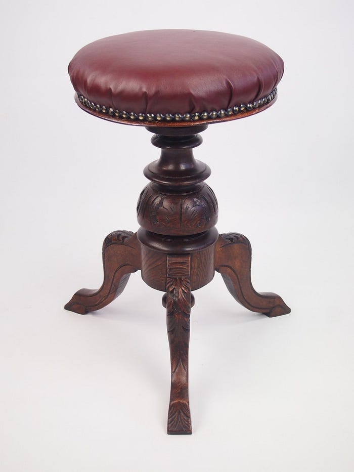
Utility is the leg of the stool; usability is the seat and padding; and the beauty is in the materials.
You can sit on a post without a seat—for a while. But for sitting for a long time, you’re going to want a seat that fits your butt, and possibly some padding.
And a gorgeous stool makes you happy to own it; to be the sort of person who owns an antique stool, who dusts it with furniture cleaner to keep the finish healthy.
But a gorgeous thing that you can’t sit on, or a stool without legs? That simply isn’t a stool. Without utility, it’s not a tool, it’s art — or at best, a floor mat.
(The utility of pure art is a topic for aestheticians or semioticians, neither of which I am.)
Utility matters. If you created a missilecar that could somehow get you from LA to NYC in ten minutes, most people would put up with it even if it meant they had to puke afterwards. Utility would win, and you’d make a fortune.
People come for utility. They’ll crawl over broken glass to get to utility.
You’d rake in the dough until the second missilecar company came along. If their missilecar got you to NYC without making you puke, it’d steal your business in a heartbeat. That’s usability.
People come for utility. But they stay for usability. (The negative view of this: people will abandon your product for something that’s equally useful but more usable.)
Beauty comes in at the beginning and the end. Apple made a killing with the world’s first lickable product, the original iPhone. Its slick packaging and candy-like UI lured in a billion customers.
(Even Apple-haters have to admit that 95% of cell phone design for the last 10 years has been “just like the iPhone, plus…”)
But beauty is fleeting: once everyone had a lickable phone, the acceleration began to find the even-more-beautiful thing to covet. Beauty is in the eye of the beholder, and that’s where marketing comes in (and we’re back to Norman’s three-legged stool). To get users to buy the new thing, it is necessary to make last year’s fashions seem out-dated. Currently we’re in a bezel-war: who can have the smallest bezel. (Spoiler: Apple lost, as other phones have negative-bezels now.) Last year it was thinnest phone. Next year it’ll be some other thing.
Beauty is used to drive demand, to keep people happy once they’ve chosen a product—or to make them unhappy to be stuck with it. Beauty lures in customers, but it can drive them away, too.
False equivalences part 2: Locked In Users
This choice presumes a free and equal market: that customers have an arbitrary number of choices, each slightly different, and can freely move between them. In such a case, people will quickly gravitate to something even slightly better—something more beautiful, or something less unusable.
This overlooks some important forces.
First, people like the familiar thing; it takes effort to get them over the hump to change. We can be pretty damn lazy:
(That’s usability winning out over wallets right there; this software setup made it so easy to buy a movie that it seemed worth $7 to this person just to avoid taking the stairs.)
So people will stick with what they’ve got—unless something seems so beautiful it lures them away, or (rarely) they spot something that seems so insanely useful it’s hard to avoid wanting it.
Fricative forces like the network effect are starting to dominate our tool ecosystem. All your friends are on Medium; if you started using something new, you’d lose that. The friends—the content—are a feature. Any new platform has to replicate not just the utility (writing posts) and usability (automatic formatting) and beauty (attention to typographic detail); it has to fight the network effect, too.
And some folks are locked in because they don’t choose what they use. The classic example is B2B software: a business buys some tool from some vendor, and because that vendor has an effective monopoly, the software sucks. Most ordering software, CNC computers, shipping and billing packages, even the horrid system that auto dealers use to write up your contracts. Most point-of-sale systems were in this boat until a decade ago, when folks like Square found a way in — and packages had to start to compete on usability.
These locked-in packages are often horrid to use, mediocre on functionality, with torturous workflows and crappy error recovery. But the users are stuck, and so their life is just miserable, every day. Those products are tremendously “successful”—wide-spread, prospering, hard to get rid of—but so are head lice.
And what about that free and equal market? Businesses do everything in their power to avoid it, because it means they have to compete on things that are expensive to create: innovative functionality, a seamless user experience, heart-racing engagement.
So once you’re using their software, they have a vested interest in keeping you there. Sometimes this is system lock-in (you have to buy all new cables!). Sometimes it’s making arbitrary choices that are importantly different than the competition—keeping you with “the familiar”. Sometimes it’s establishing a network effect for something that doesn’t really need one: do I really need to know what songs my friends are buying? No, but once I know, it might be enough to keep me from getting my music elsewhere.
It’s hard to draw a straight line between the sum of the parts and a product’s success. But let’s talk about that other side of the statement, too.
Not Even Wrong, Part 3: Success
Success is hard to measure. Well — that’s entirely not true. In capitalism, we have one metric: profitability. If something makes money, garners the most sales, we call it “successful”.

By this metric, the most successful game of all time is…Minecraft. Which, yeah, is a pretty good game, but it doesn’t win out on every scale over every other game ever.
And money? That’s how capitalism works. For a company to survive, it has to pull in revenue. For a public company to thrive in the modern economy, it has to beat sales expectations every quarter so investors don’t leave. That means big sales or a product gets dropped: the fitness test for products is too harsh, focused on short term success.
So then there are examples like WordStar. A humble text editor created in the mid-80s, it hit a sweet spot with a lot of users: just enough smarts to help them lay out their writing, not so much intrusion that it killed the writing process. It was, above all else, usable.
(Side note: I used WordStar for about three minutes in the 90s, and then went back to vi. But I’m a few sigmas out from normal.)
WordStar quickly established a solid, loyal following. When its developers stopped supporting it, users desperately clung to old machines that still ran it, sometimes for decades. When forced to switch, the difference in usability was the rub. Here, a noted vampire-biographer:
“WordStar was beautiful, sublime. I was so sad when it became ever more difficult to use it. MS Word is a mess compared to WordStar.”
- Anne Rice
1990s-era MS Word had a thousand features that WordStar didn’t. It was infinitely more useful, with modern features like mixed fonts and sizes, page layout, even macros. WordStar users didn’t care: those weren’t the features they needed. Instead some intrepid users used that same macro system to create a “WordStar Mode” for MS Word.
That’s usability. Users will stay, dammit, with the thing that’s comfortable to use. There are a thousand things around you like that: old hammers, vintage cars, family barber shops, home cooking. Things that Silicon Valley keeps trying to ‘disrupt’—and sometimes they succeed, and sometimes they don’t.
I think that making things that users fight for—that they dredge old machines out of the closet for, that they tell all their friends about, that they still speak dreamily of 40 years later—well, that’s a form of success, too.
I guess it all depends on how you measure.
How will users experience your product?
So now we’ve come full circle.
It’s up to you development teams, to work together. Developers, the ones that write the code, the final say about what gets in the product. UXers, there to help make sure that the code, plus all the other pieces of a product, deliver a positive experience for users. QE, to make sure it works the way you intend, to make sure users don’t break it in unpleasant ways. Doc, to help in places where the software itself just can’t support the user, and Support, when that fails too. Management and Marketing, to keep priorities straight and mouths fed; Ops and HR, to make sure everyone has security and a place to work.
If you view UX as a tacked-on piece, it makes everyone’s job harder. If you try to assign success or failure to one piece of the stool, it makes it harder for the whole to gel. It creates adversarial thinking, which damages team formation. Most importantly, it leads to a fragmented experience for customers. Hit them with enough sharp edges, and they’ll leave.
Or you can work to make the stool amazing from top to bottom, and reap the rewards of happy, productive users.
